Snore intensity
What does this mean for me?

This is a score based on how loud and how often you snore. The colour of your score circle indicates how intense your snoring is:
- = nothing

- = mild

- = moderate

- = high

- = extreme

- The average SoundSleep user snores with a high intensity score of 53.

Snore Classifier: How it works
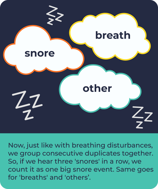
We use a ‘Snore Classifier’ we’ve developed that zooms into tiny 0.2-second sections of audio data. Our Snore Classifier gives us three options: ‘snore’, ‘breath’, or ‘other’. Basically, it tells us whether a snippet sounds like a snore, a breath, or something else entirely.

We look at 20-second chunks of the recording where we’ve detected snore events. In those chunks, we average out the volume (in decibels) and the duration (in seconds) of the snoring.
To get the snore intensity, we turn those values into percentages and find their mean. So, a lot of loud snoring in those 20 seconds would give us a high score, around 100%. But if it’s not much snoring, or it’s really quiet, we might get around 0%. If it’s a mix of loud and quiet, maybe around 50%.

The highest intensity figure in the doughnut (yep, the circular icon is called a doughnut!) isn’t always the overall highest intensity. Why? Well, stick around for the next section to find out…
The time chart
Let’s take a look at the graph that appears with your report. It’s pretty much a visual representation of snore intensity over time (a score based on how loud and often you snore).
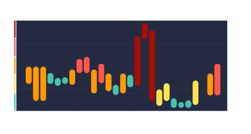

Each bar on the graph represents 15 minutes of snoring intensity. Within those 15-minute chunks, we’re looking at the intensity of snoring in 20-second sections. That’s like checking out little snippets of snores over time.
To figure out what goes on each bar, we look at all those 20-second snippets and pick out the middle values. It’s kind of like finding the middle ground between the softest and loudest snores.
What do the bar colours mean?
The green bar range means no snoring has been identified. Yellow means your snoring intensity is mild, orange means it’s moderate, while light red means severe. Dark red indicates the most severe snoring intensity.